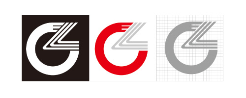
In order to bring us into a global network world, the development goal of the globalization of the world is represented by Logo.
In the Logo by L, Z two English letter of the combination of deformation, the form of the perfect fusion of two words. Red l presents a circular arc shape, arc type represents with "China-- China", "Cables-- cable" "Center-- center" of the and the Z, l deformation after the perfect combination, reflecting the team is a: grow up healthy, positive, unity, progressive, harmonious, communication with strong cohesion and expansion, reflected in relaxation degree, have Rong Naida industry demeanor.
China red as the main color, grey complementary color, two-color organically combined together and expressed interest in traditional and not stubborn, innovation without exaggeration, showing deep and wise personality charm with the overall tone. The main tone of Chinese red on behalf of enthusiasm, a symbol of the enthusiasm of the Chinese people, sincere and honest service concept. It like a wheel rising sun, illuminate and innovation road, leading and advancing with the times, booming to hundred years!
Corporate
Mission
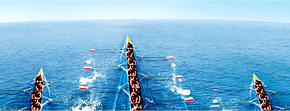
Prosperity
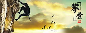
Enterprising
Spirit
Management
Philosophy
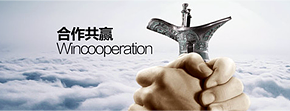
Management
Philosophy

Quality
Thought
Social
Responsibilities